Generic boxes help to easily define one's own boxes to apply certain CSS styles to them.
If you want to render a specific box in your project where it is important to apply a specific style, use the generic box macro. It allows you to add a CSS style to the box.
The box does not allow to attach the CSS style sheet. The styles are defined in the global CSS style sheet provided by Confluence.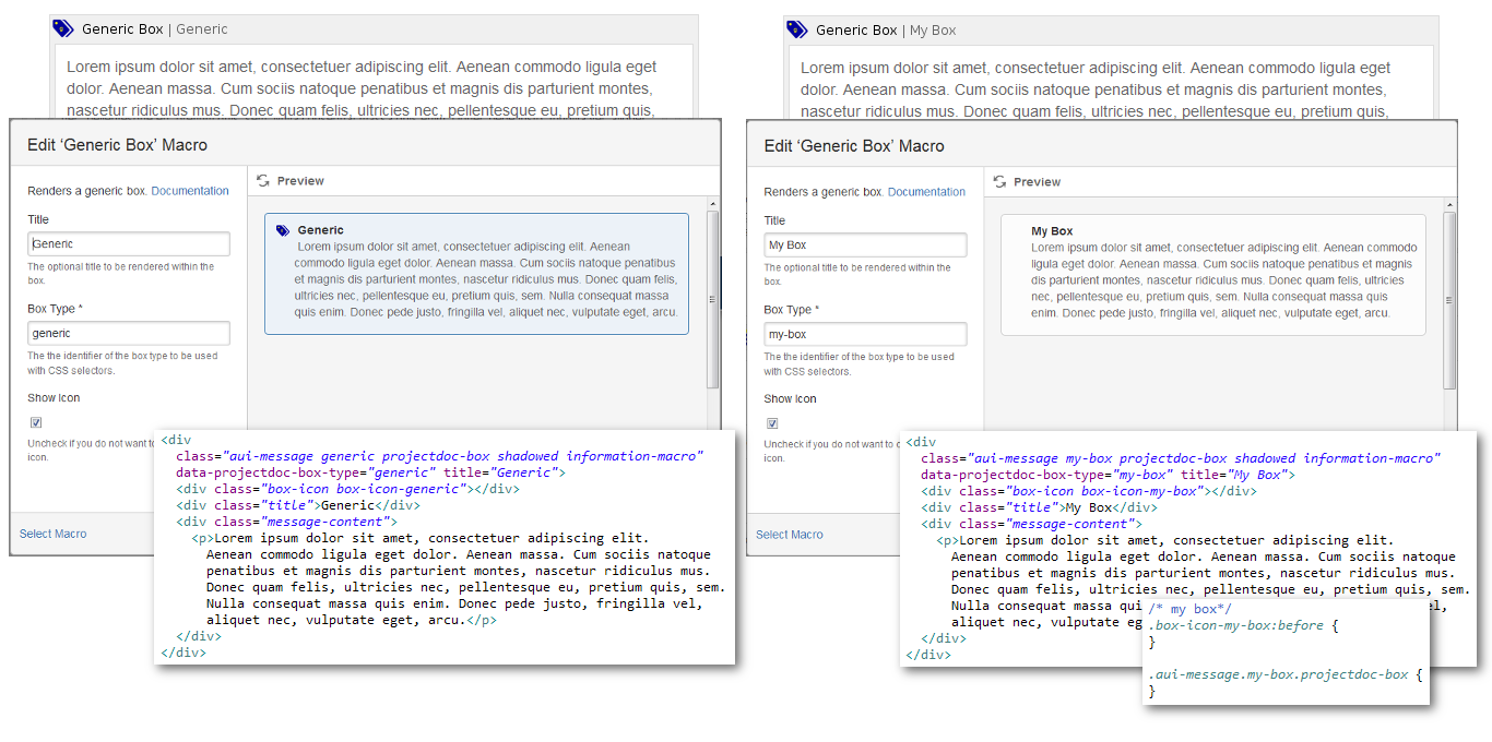
The macro provides the following properties for configuration.
The optional title to be rendered within the box.
The title of the Generic Box
A generic box of type 'todo'.
The the identifier of the box type to be used with CSS selectors.
.box-icon-todo:before { content:url(https://www.smartics.eu/confluence/download/attachments/6554577/generic_20x20.png?api=v2); color: Purple; } .aui-message.todo.projectdoc-box { background: #9966CC; border-color: Purple; color: white; }
Uncheck if you do not want to display the box icon.
The title of the Generic Box
A generic box of type 'todo'.